
Better analysis of slope dependence on flight length and further insights in the SMAP code
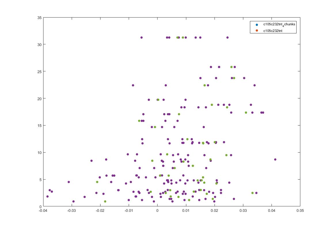
This is another way of showing how the slope of the SMAP analysis varies with length. I have choped the time series in 4 chunks and saw what was the slope for the chunks and for the whole time series. I think this is the best statistical way of doing it, it should not depend on what line was tested. I cannot see any effect.
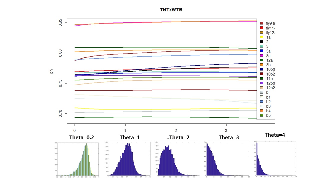
Here below is just to show what I found out in the code. What I thought that theta was controlling for nonlinearity in the model, for me it seems rather a control for under- overfitting in the model. So I might need to read the paper and see what do they say, and if it is the same as what I found out in the code.
Do not agree with Sathish?
So this is the final graph assuming that 20Hz is the sampling rate. Sathish was not sure what it was and he said he will check.
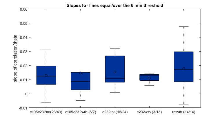
To have a better overview how the length of the flight compares with the slope obtained from the SMAP. There is no big correlation whatsoever with around 100 flies. Sathish found this in his thesis with data from seventy something WTB, but to me it seems like an anecdotal result.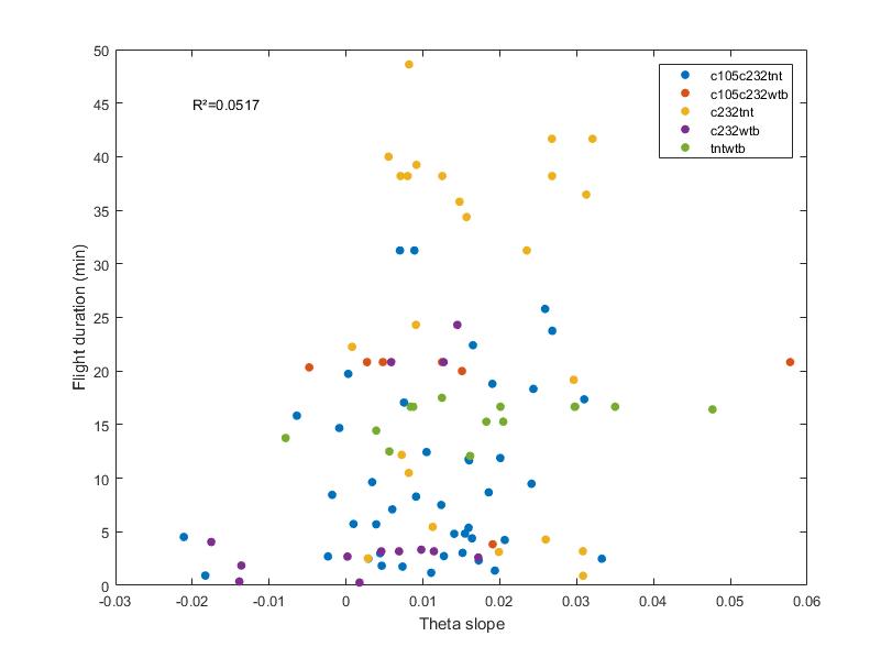
Here the same as above, just for showing the fit line.

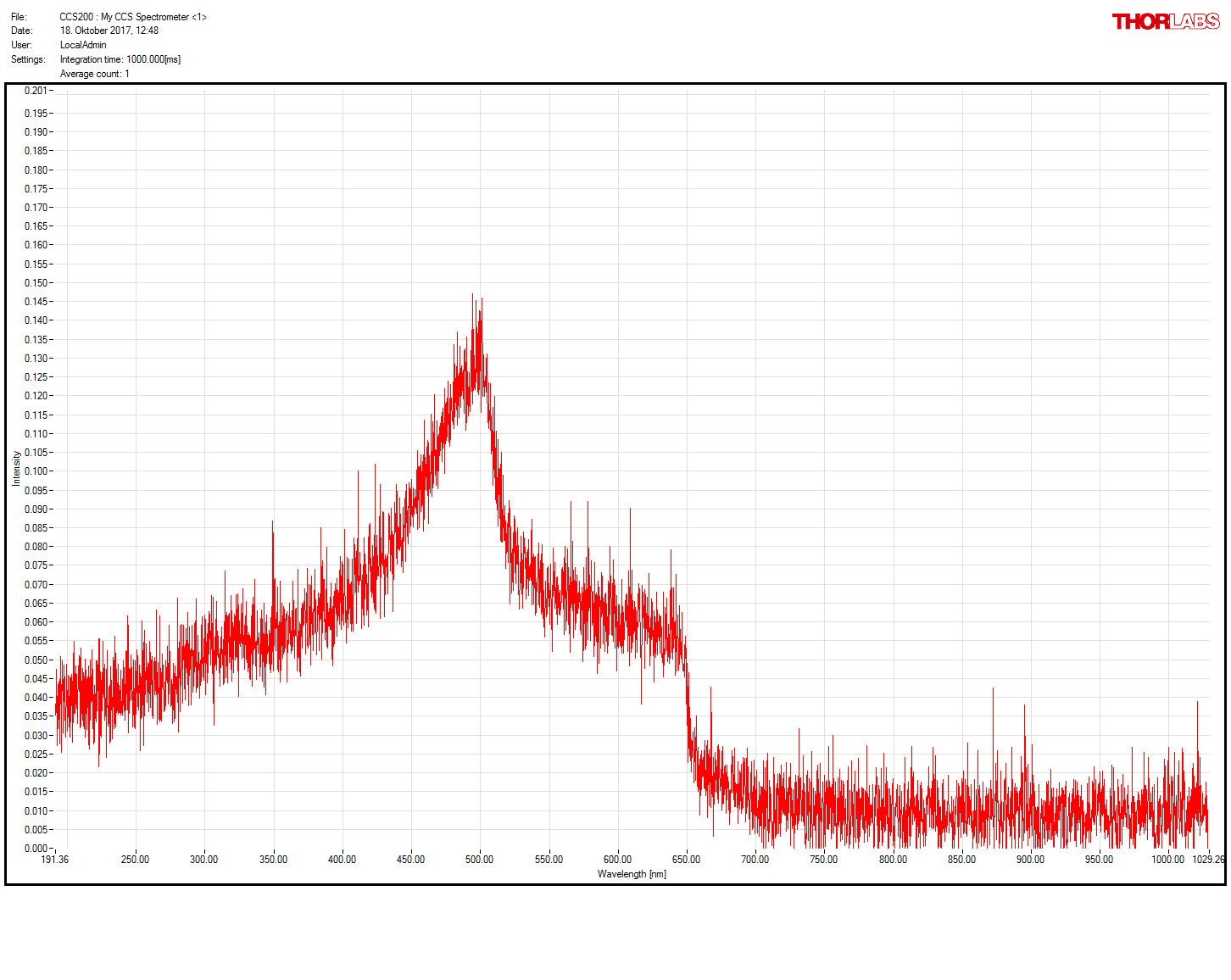
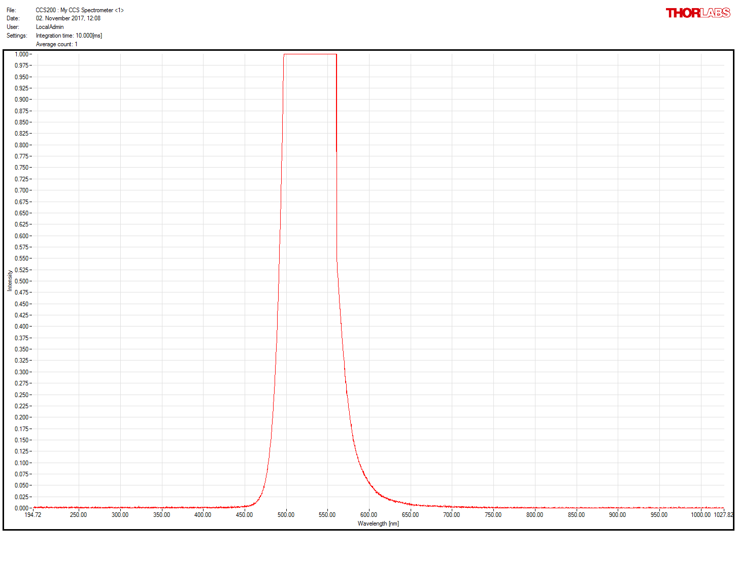
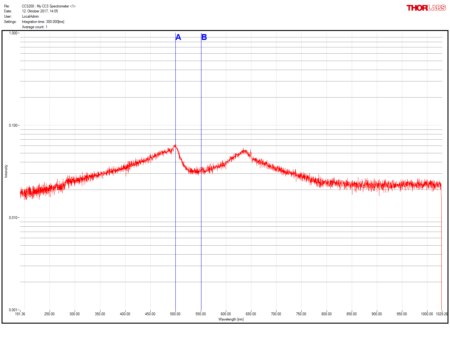
Thornlabs spectrometer working!
After getting a new spectrometer, we confirmed that the first one was faulty. Comparison of old (1st and 3rd measures) and new (2nd and 4th) spectrometer. Now much more sensitive and the right spectrum measured for the green LED present in the spectrometer itself and for the light comming out of the light guide coupled with the red LED (whose spectrum does not seem to change after travelling through the light guide)

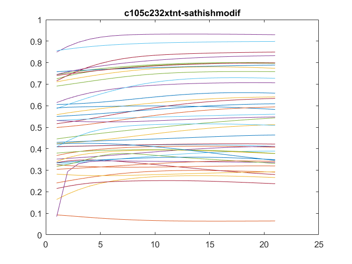
All sathish data analysis
This are the results of all of the flies analyzed from Sathish. I just need to know the frequency of the acquisition to exclude the ones that are below 6 minutes.

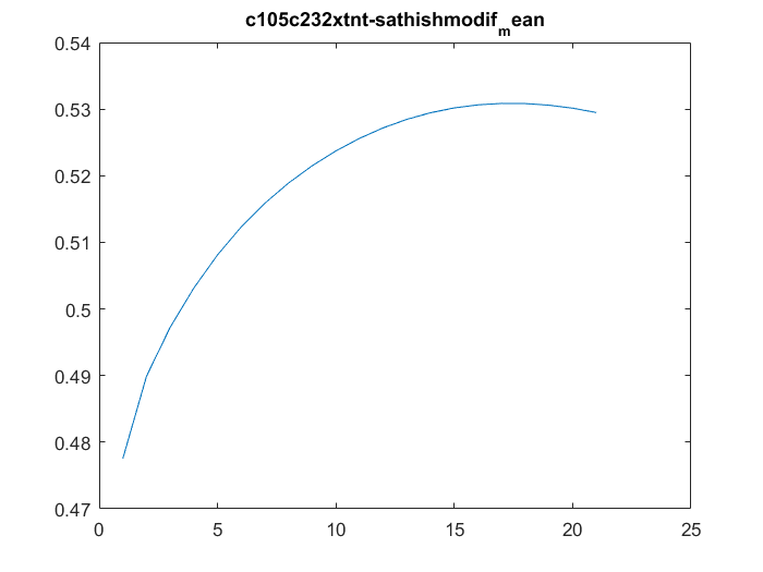
Sathish data
I have analyzed the c105+c232 > tnt data from Sathish. There are a total of 43 flies, although many of them only flew for a few minutes, and therefore should be discarded. Below all of the individual fly scores. I need to analyse now the other groups. This is btw the modified data set, whatever that means for Sathish.
This is a video of the projection from the torque data from Maye et al. 2007. The spikes are not that well sorted in this case as in the Strokelitude. I guess this is because the spikes do not look so smooth.
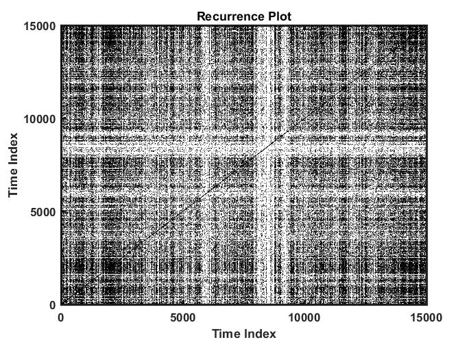
Recurrence quantitative analysis
This is an example of a recurrence plot analysis. In the first graph is shown in single point in time in the optimal embedding dimension and the distance to the other points. For the recurrence plot analysis it is needed to put a threshold to make it binary. This is the second graph. From this second graph one can count many parameters like determinism, laminarity and so on. From what I see, the plots from the Strokelitude as well as Bjoern´s flight simulator in Maye et al 2007 show similar pattern (kind of crosses with vertical and horizontal lines).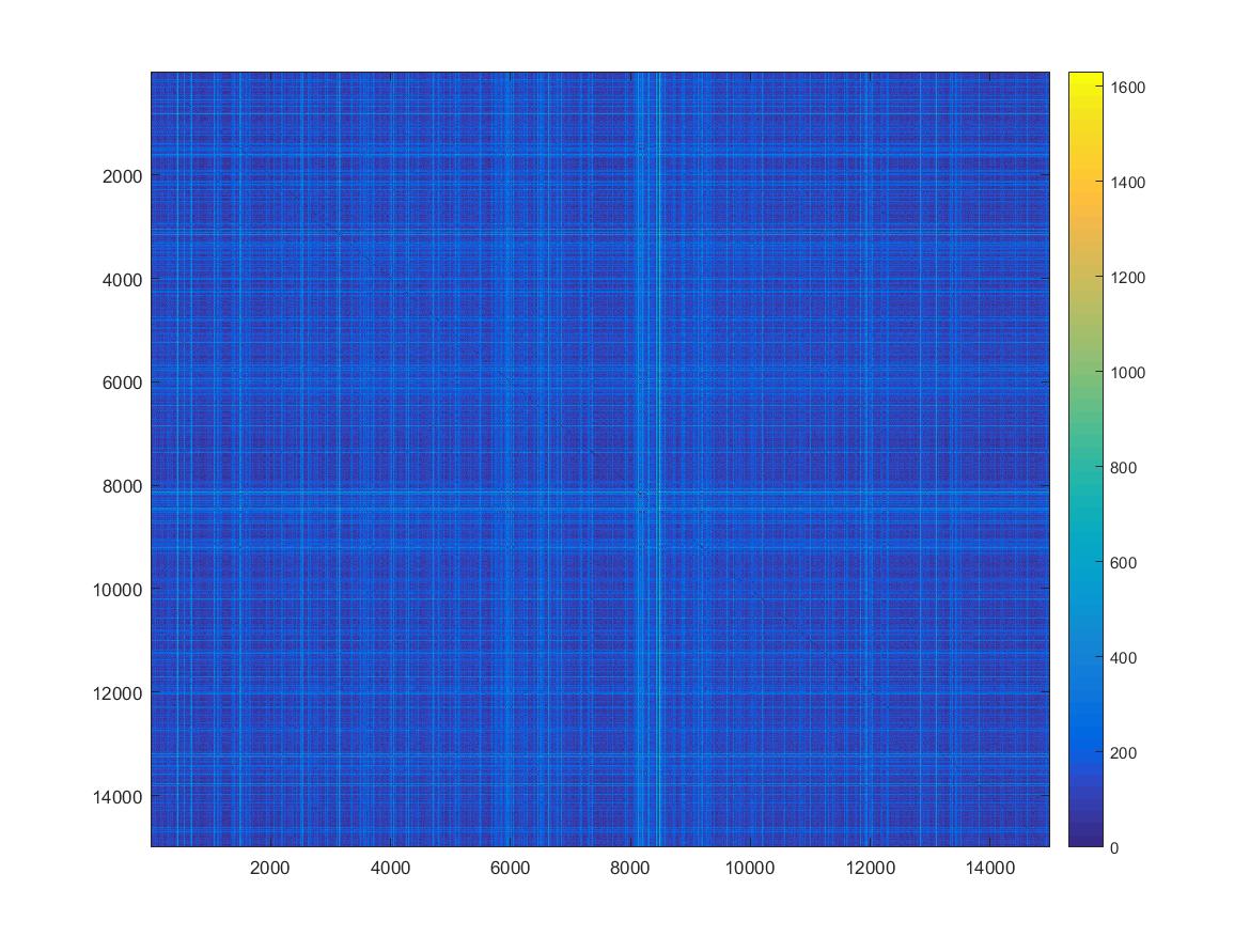
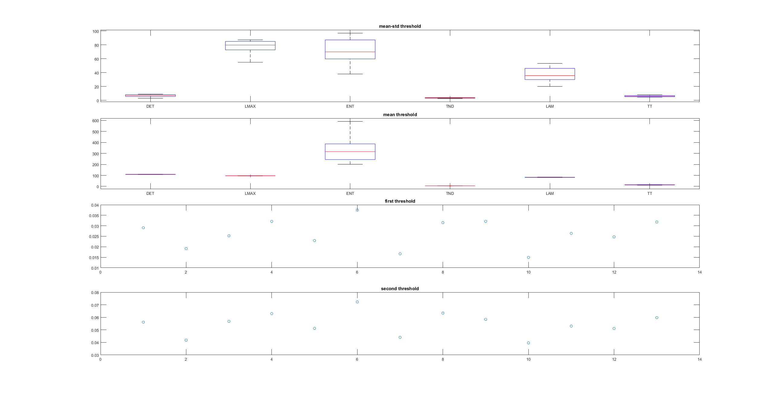
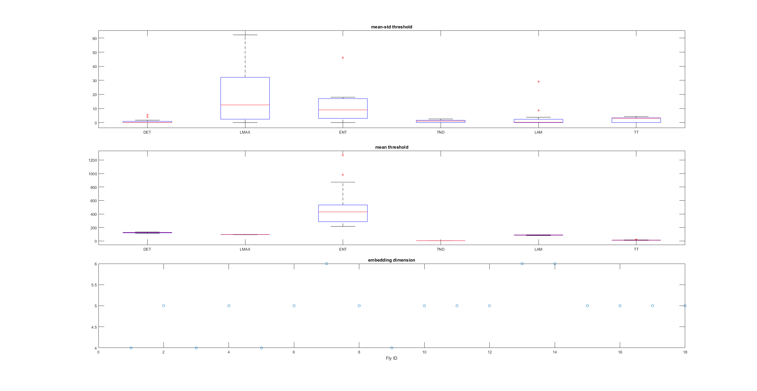
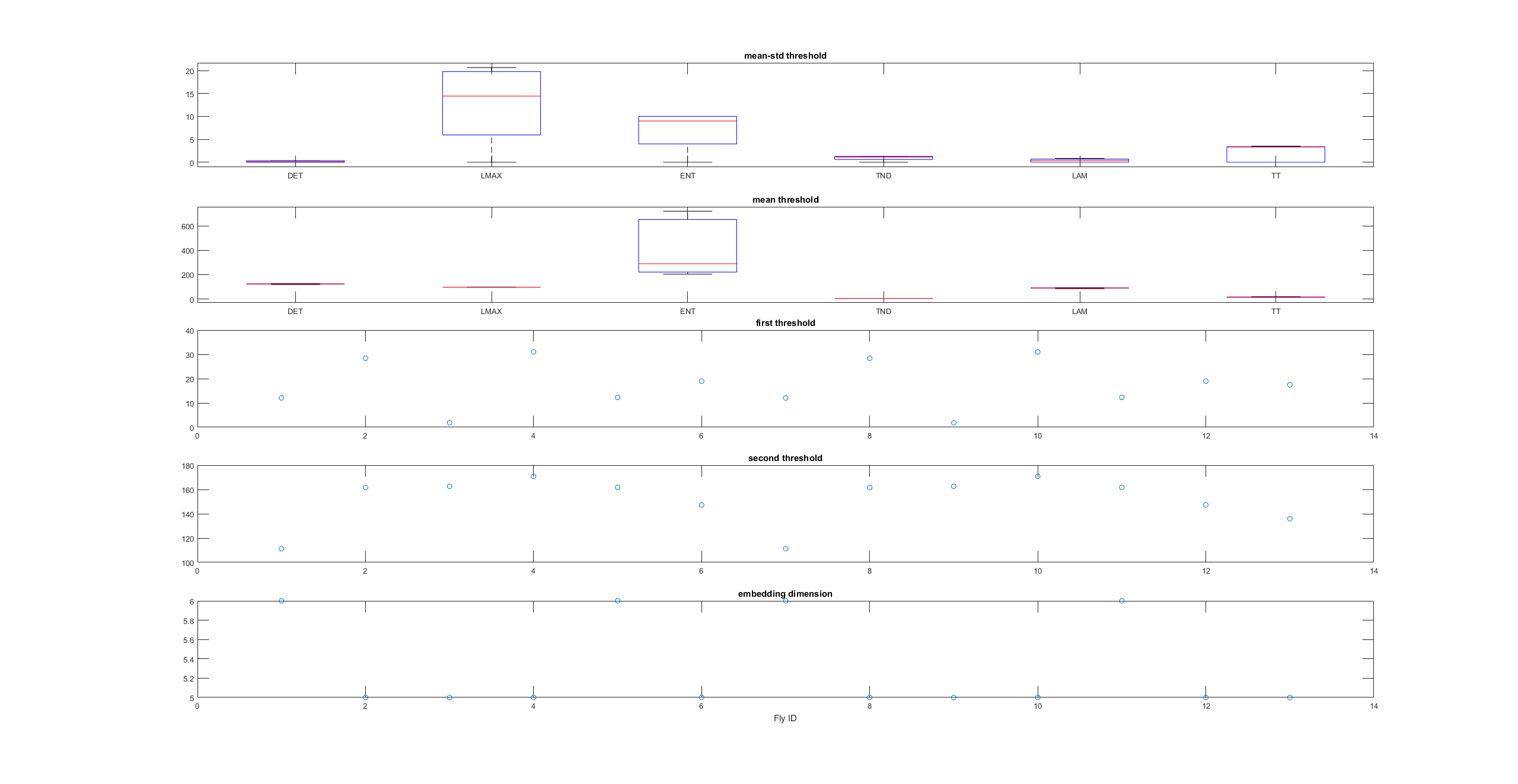
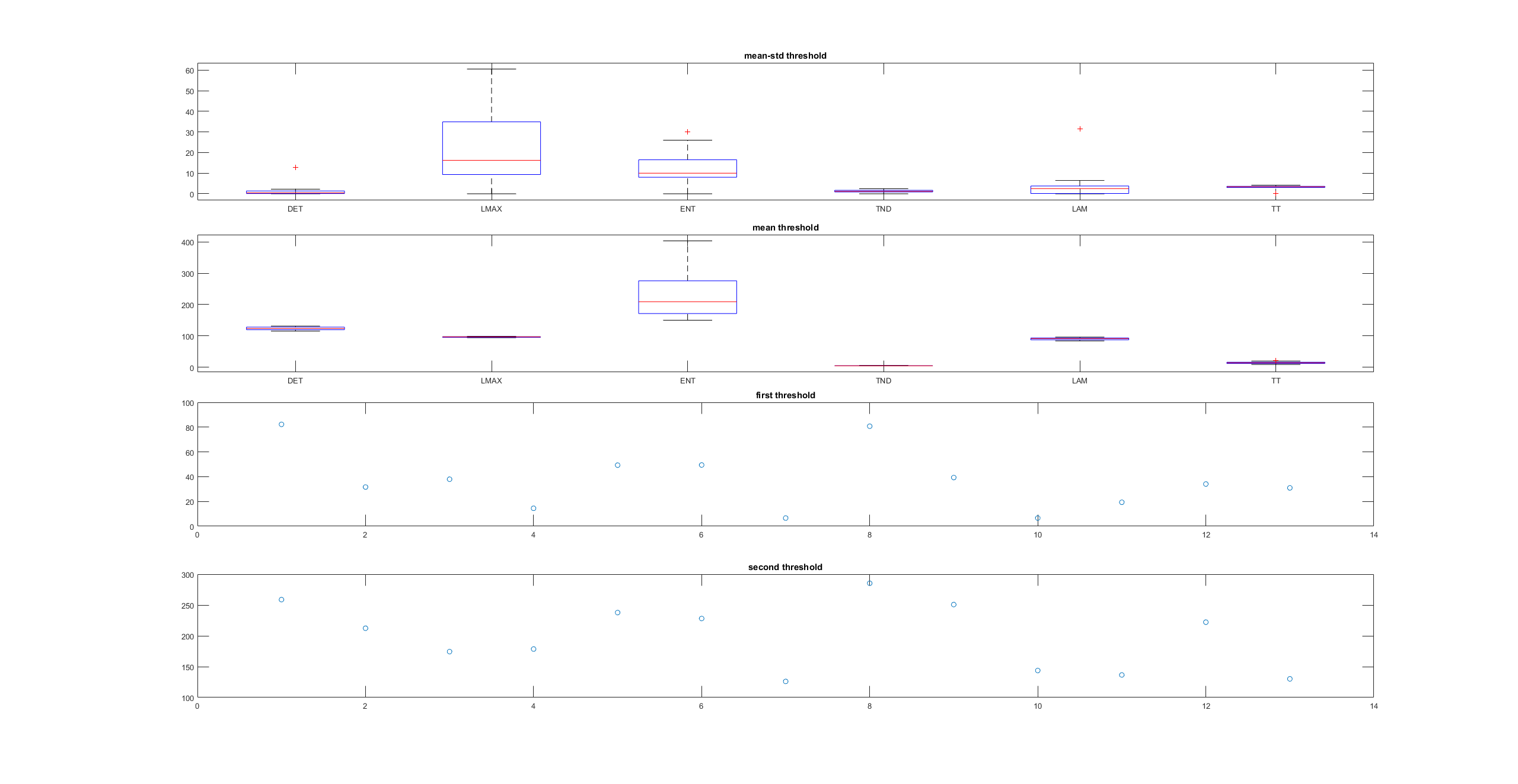
This is a measure of the Recurrence Quantitative Analysis of different groups. Recurrence threshold is a tricky and to some extent subjective measure, so this is why I tried two different ones.
DET: recurrence points that form a diagonal line of minimal length, the more diagonal, the more deterministic.
LMAX: Max diagonal line length or divergence. Sometimes considered as an estimator of max. Lyapunov exponent
ENT: Shannon entropy reflects the complexity of the system
TND: info about stationarity (trend)
LAM: Laminarity is related to laminar phases in the system (intermittency). It is tallied as vertical lines over a threshold.
TT: Trapping time, measuring the average length of vertical lines. Related to laminarity.
Automat
One stripe
Openloop
Uniform
More on the attractor
Video of the attractor projected from a chunk of flight trace. Here one can see the difference in the trajectories of up- and down spikes. So here is another way of spike sorting by the way :).
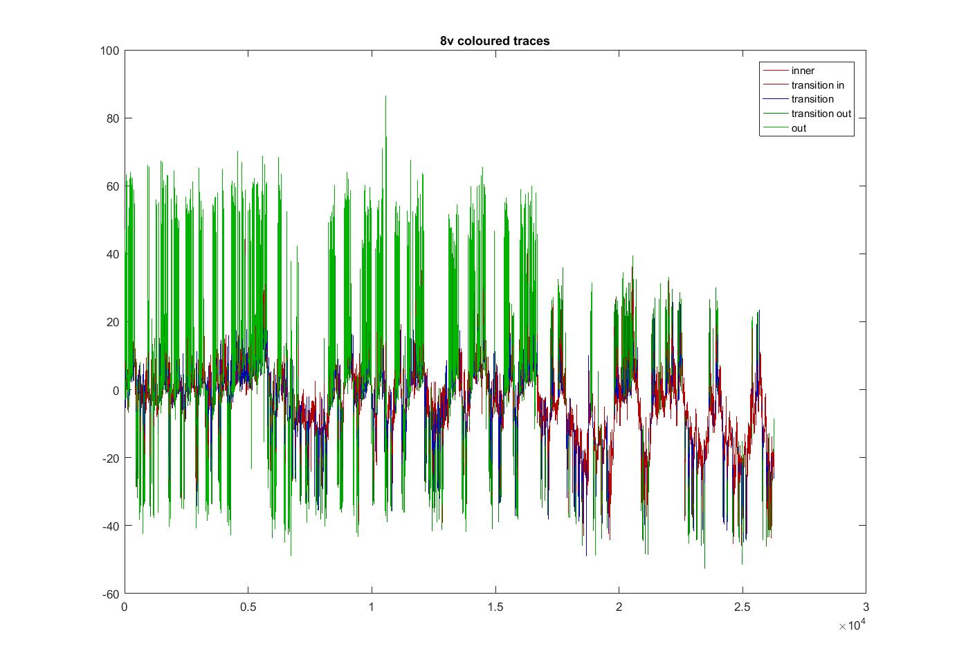
Coloured traces depending where the locate in the attractor projection. Green means that they lie outside and when they stay with the PCs around zero its in red. The fly1r above does not look so clean as the v8 fly below (the cleanest measure I have)
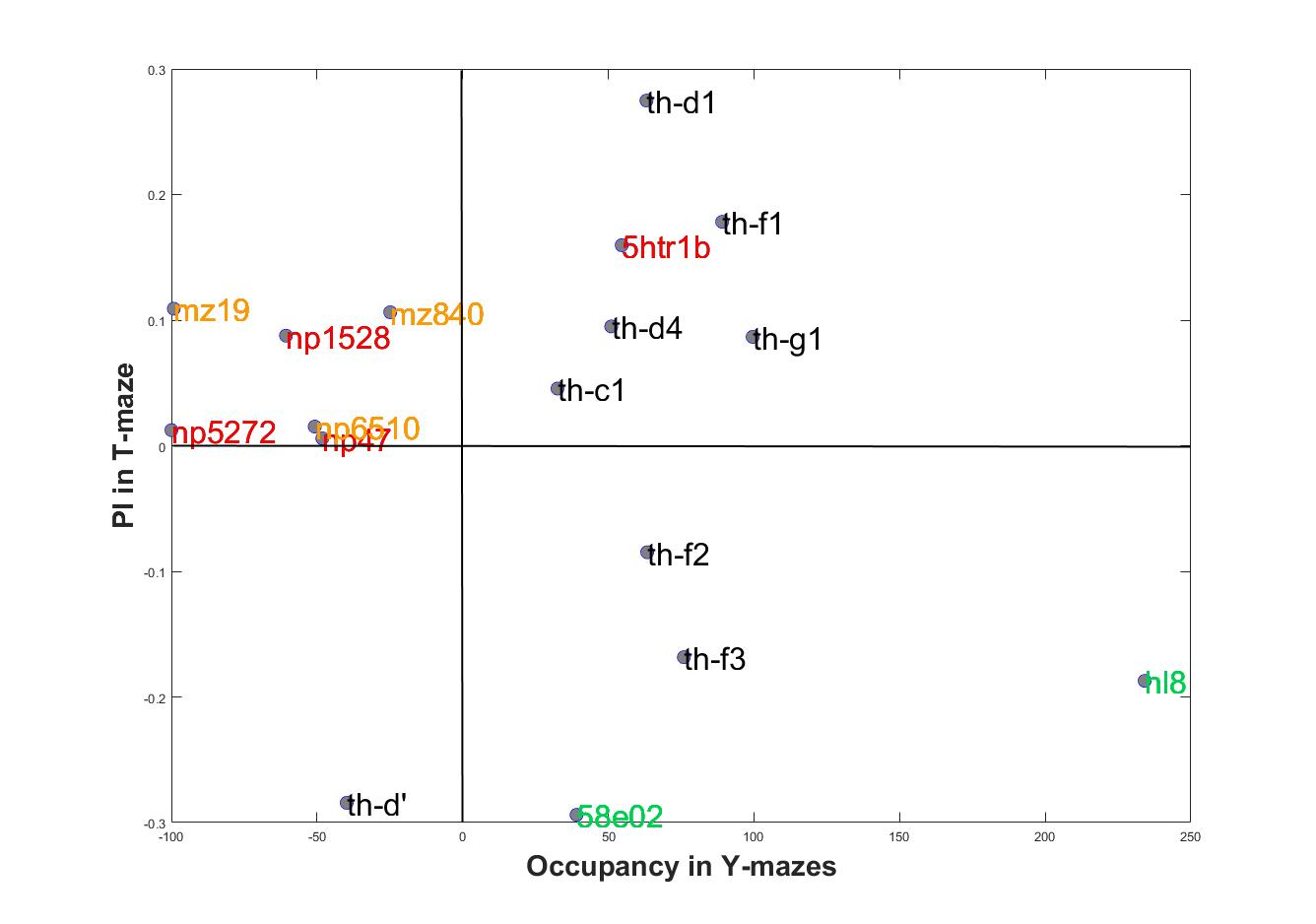
SMAP results
These are the results of the SMAP for the TNTxWTB. I also have done a few for the c105;;c232xWTB but there is not much to say. I would say that the cleanest lines show a bigger slope, but prone to subjectiveness.
In addition, I have done some animations of the attractors that I have posted on slack because of size.

Attractors for c105;;c232>TNT
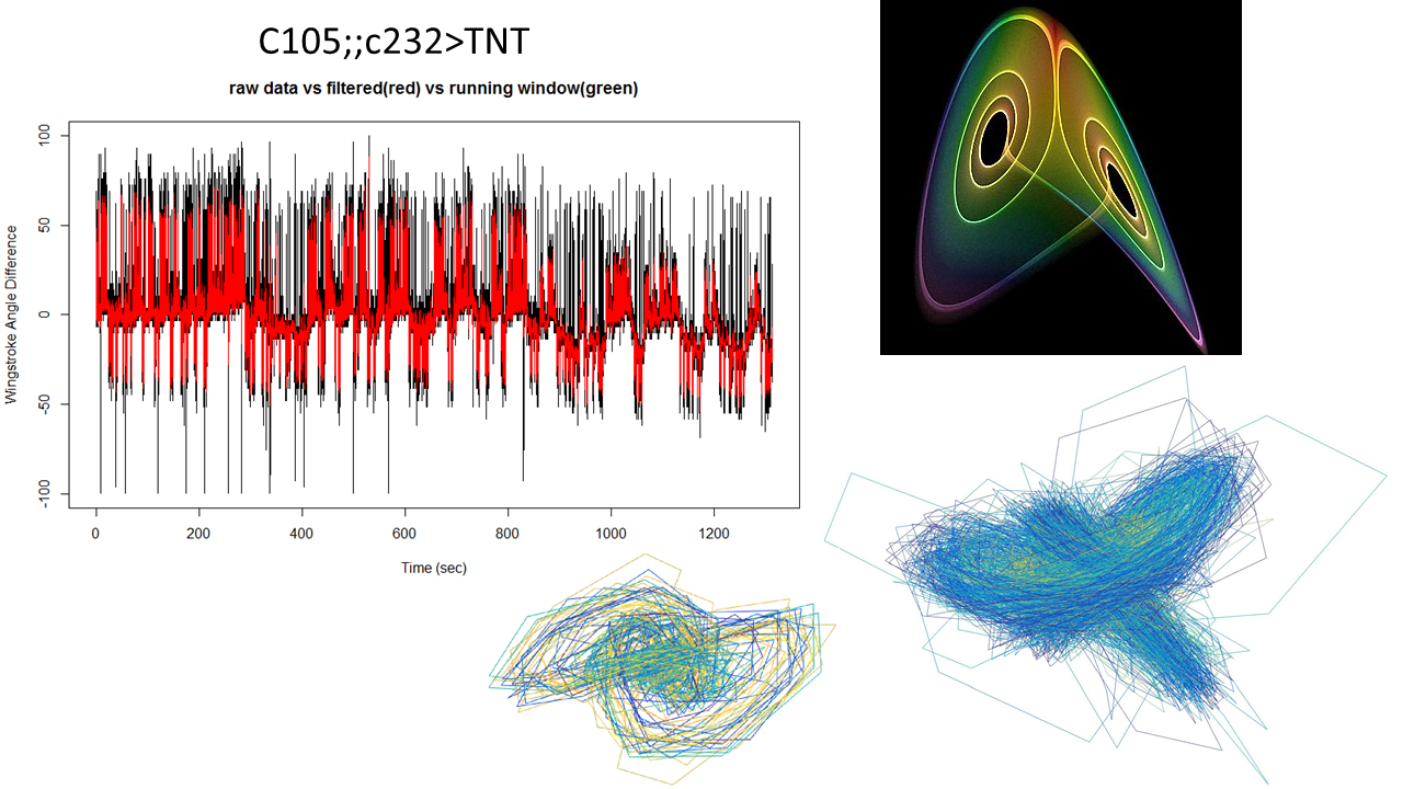
This is what I showed about one fly from this line showing the attractor.
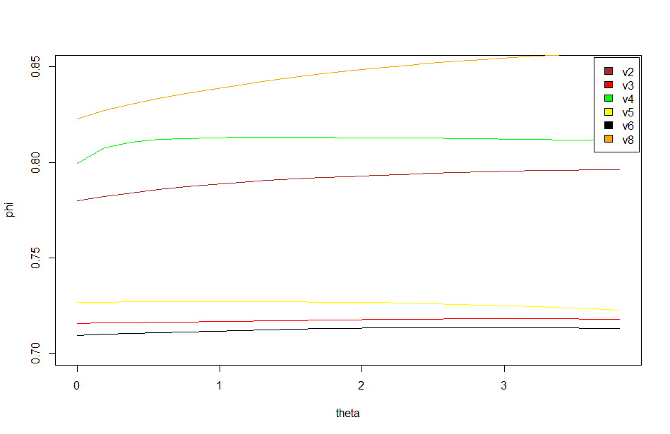
This graph is what I forgot to show in the lab meeting. There are the 6 best traces from this same line. All of them selected ad hoc subjectively. The three best of them to my eyes are exactly the three above in the graph (v8-this one is the one shown in the picture with the attractors-,v4,v2). What does this means? the ones with better traces (subjectively) have higher offset in the phi, this means that they are more predictable overall (maybe because more resolution?). In addition, they show higher slopes which means more nonlinearity.
thf1 line from screen
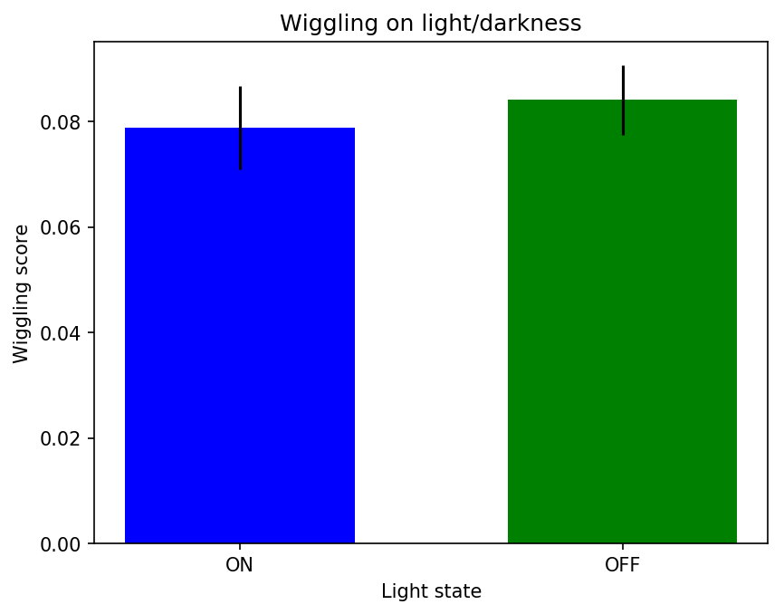
 This is the first line I completed from the screen. What it is more important is that I found out that NorpA;UAS-Chrimson has orange eyes, when it should be red. So I think I will start to do the line again and meanwhile test the contaminated line to see what the phenotype looks like