Prediction analysis
on Sunday, January 17th, 2016 7:02 | by Christian Rohrsen
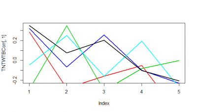
These are just 5 flies (WTBxTNT) from the strokelitude where I measured the correlation coefficient on the Y-axis. In the X-axis, first bin is from 0-2 s of prediction, second is 2-4s and so on.
It seems as if some flies do nicer than others. Although it seems to me that a correlation coefficient from 0.3 isnt a big thing with all this variability. I have to find out the best binning though, I think it needs to be much more in the short term.
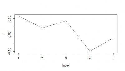
When I do the mean of the 5 flies measured, I do see a very slight decay. But once more I would say the decay is from the bin 1 to the second.
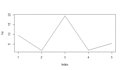
Here I tried another way, the RMSE, which according to literature and to my own reasoning should be a better analysis. I think RMSE measures just the differences of the absolute points whereas correlation coefficient is rather if the direction and degree of variation correlates (covariates). I find a very weird result. The fit is bad, the it gets better (but it should be just a chance event because correl coef decreases) and then it get very bad and so on.
I think for the future I have to make ensembles of two k neighbours maybe, which seem to increase the prediction power 10-15%. And maybe not look that much into the future as it was done here (10s).
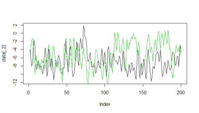
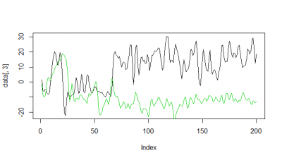
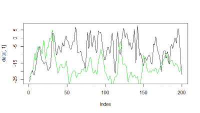
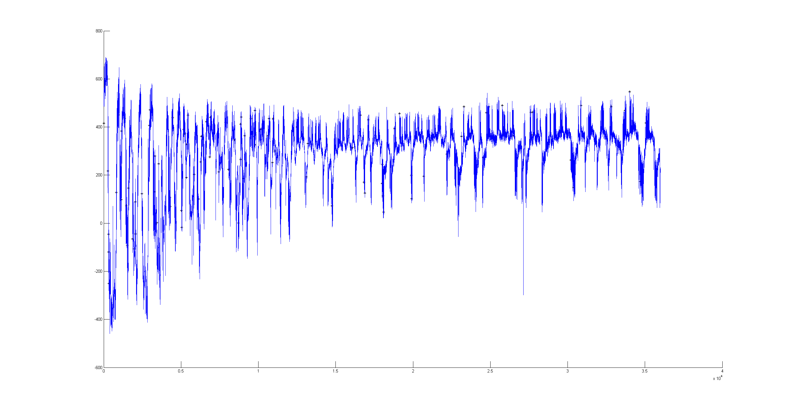
Here some examples of predictions vs observations:

Category: R code, Spontaneous Behavior, strokelitude, Uncategorized, WingStroke | 1 Comment
Frequency spectrum for the platform
on Monday, December 14th, 2015 2:35 | by Christian Rohrsen
 Spectrum with the x axis showing the frequency so that 0.5 is half of the measuring frequency (in this case 20Hz and so it measures until the Nyquist frequency: 10Hz).Here we see the result for the three platforms without any flies. From time to time I hit the table to make some signal in the platforms
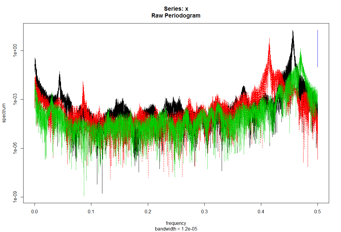
 To compare the power of the frequency put together platform with (green and black) and without flies (red).
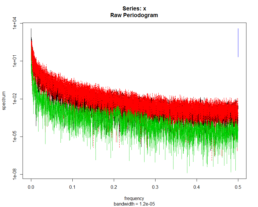 This is the case of three different flies in each platform.
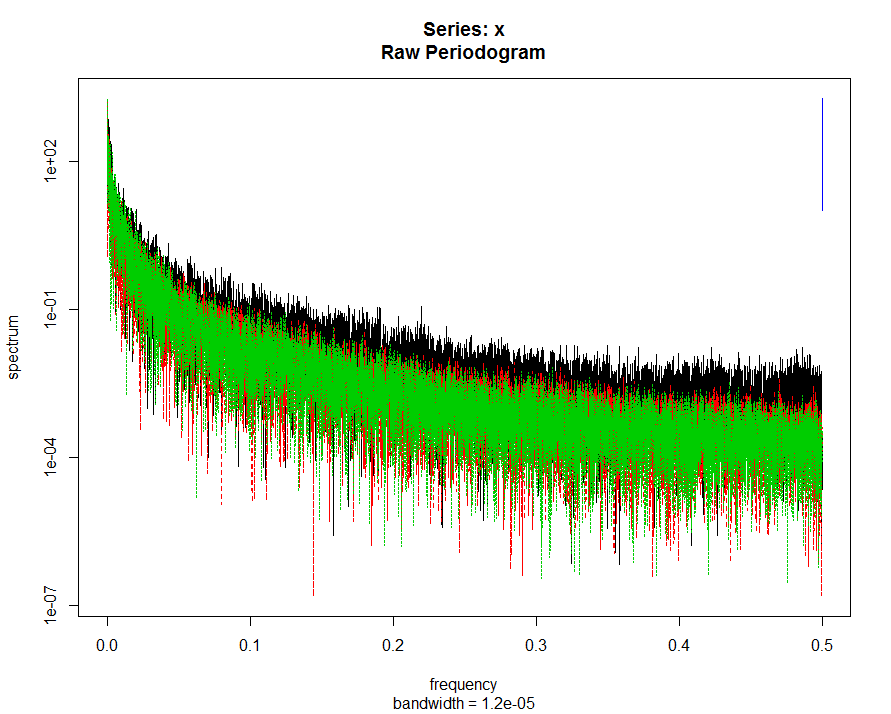
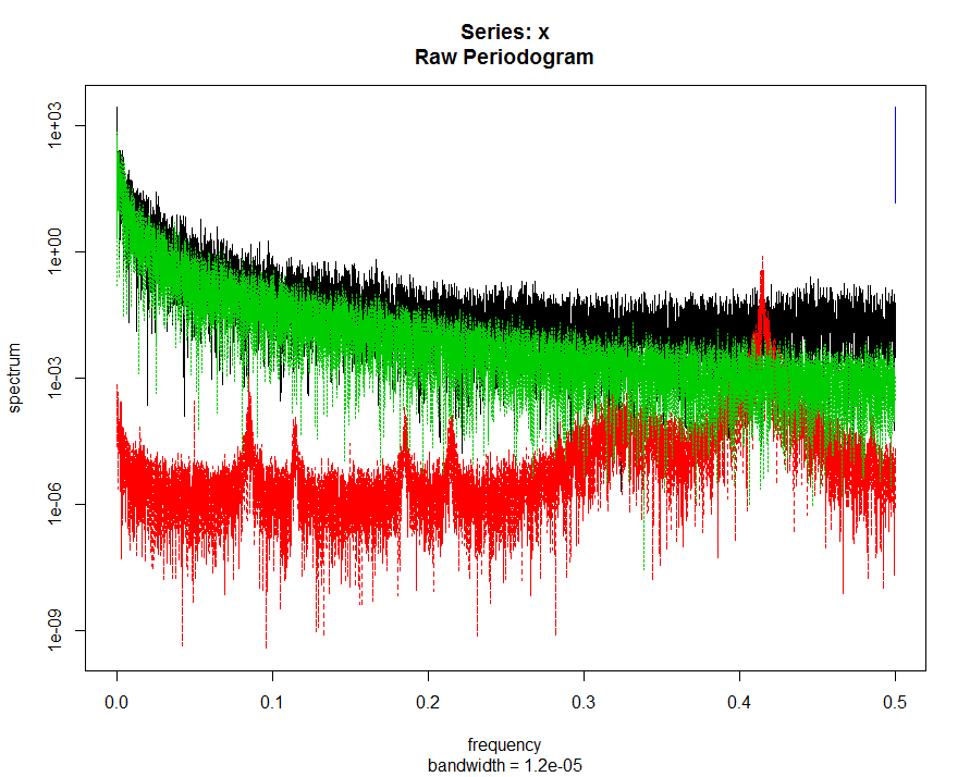
Here the same flies, just in different platforms. There we see that some platforms show stronger signal than other (if I remember well). So is not the fly making the difference. But I have to check. 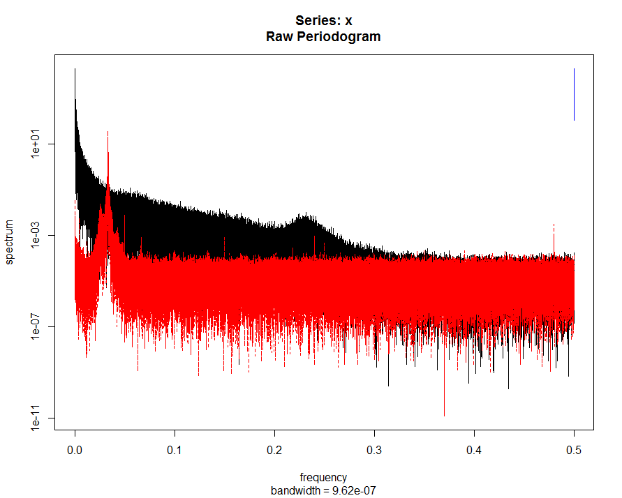 Measuring in this case the 250Hz raw data. In black with a fly and in red without fly
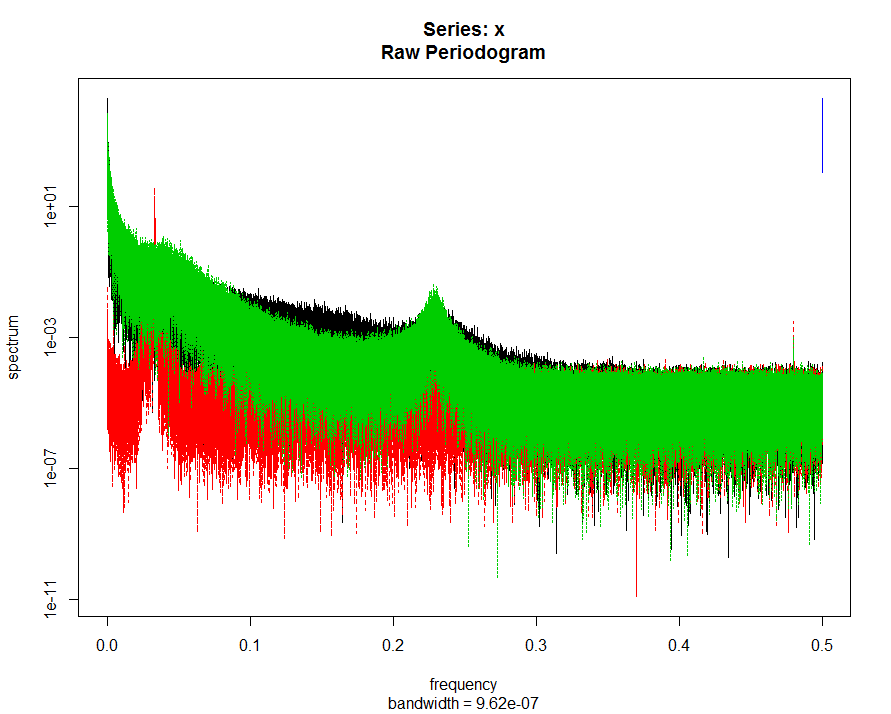
Measuring in this case the 250Hz raw data. This time with and additional fly (green). We can see a characteristic peak at around 60Hz.
Category: R code, Spontaneous Behavior | No Comments
Interpolations and Spike analysis
on Monday, December 7th, 2015 2:42 | by Christian Rohrsen
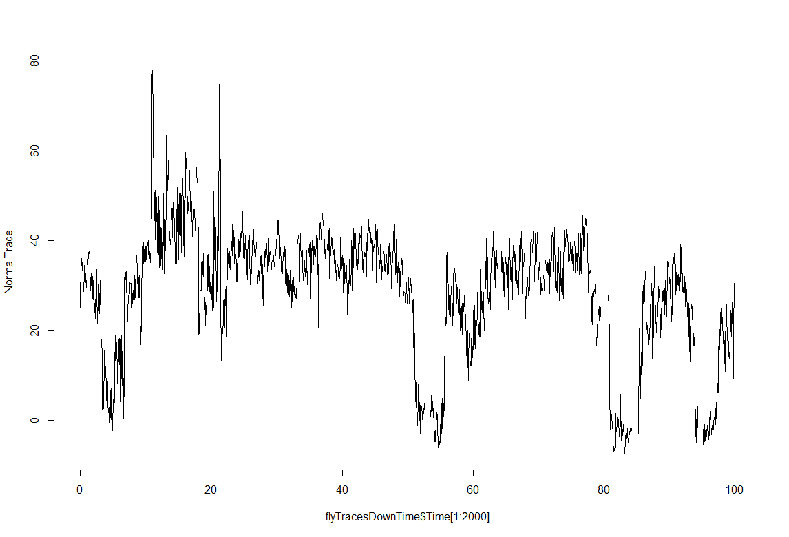
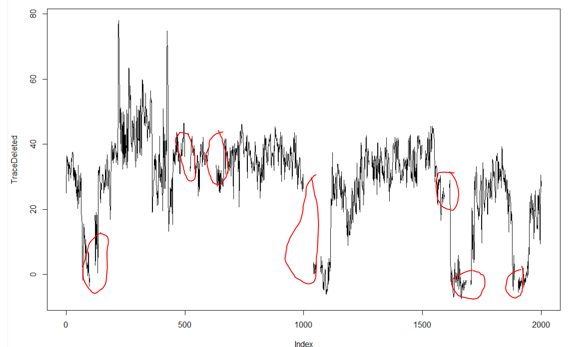
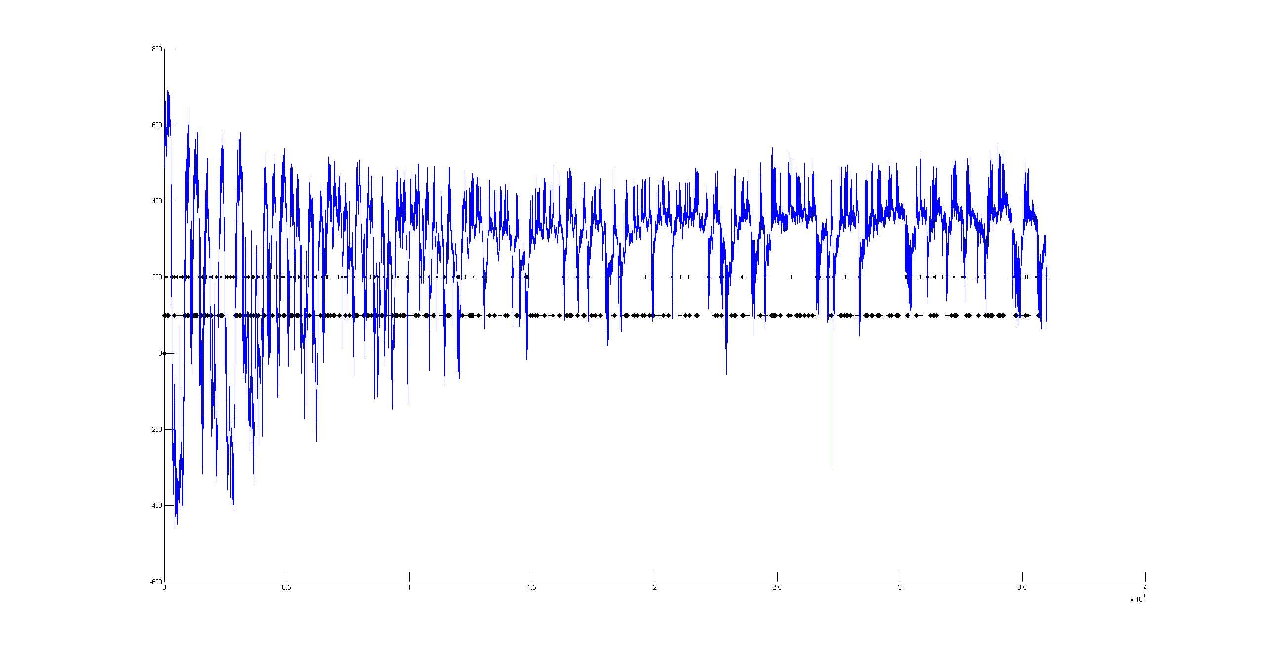
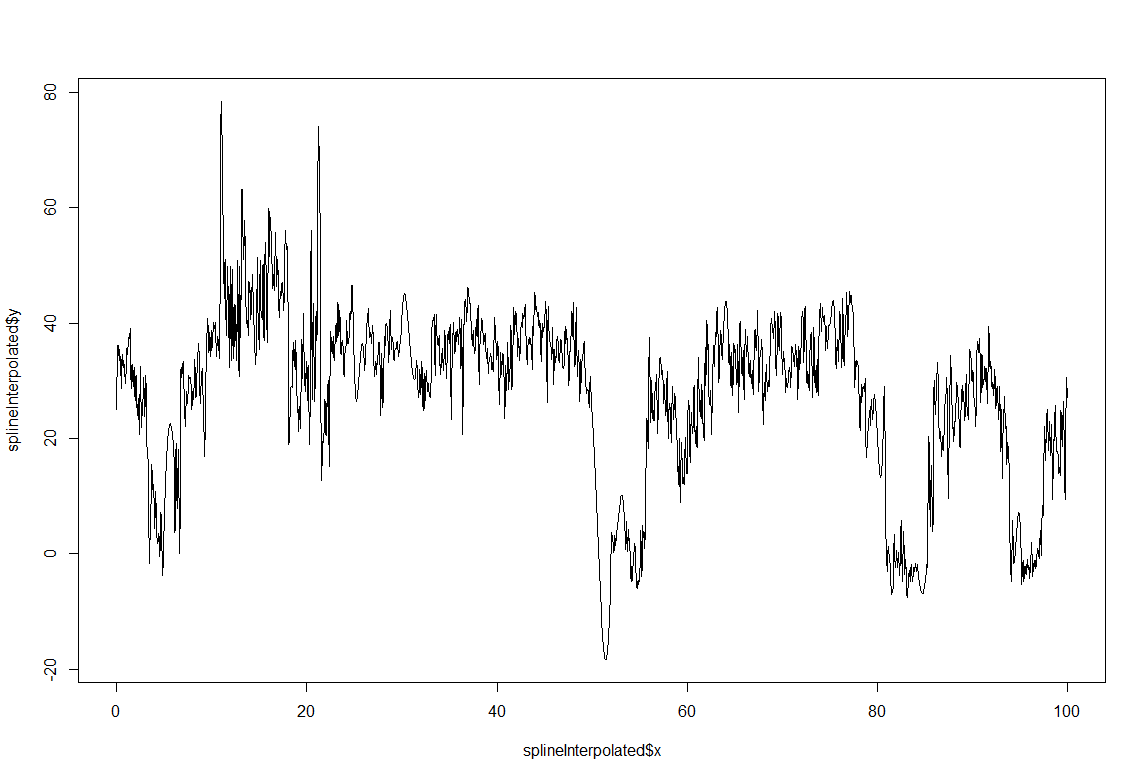 This is just a proof of concept how useful the interpolation is for this purpose: and I would say it´s almost useless. If I delete from the raw data (1st graph) some pieces (2nd graph), and I make a spline interpolation (3rd graph) it doesn´t match that well. Linear interpolation was done in previous weeks with not much of a success. Anyway, the result of a linear interpolation can be imagined by eye just by joinning the two ends with a straight line, and this doesn´t occur in the fly behavior as we can see in the raw data (1st graph).
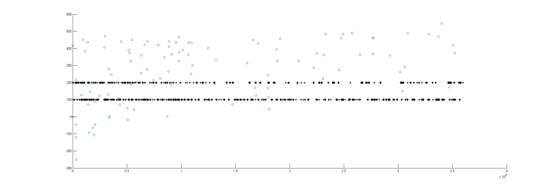 There could be two posibilities for spike detection: one is the one from Ute and the other one is the one from Maye. It seems to me that the one from Maye is more precise. I have run the script but I do not get so many spike detections as he gets. I did try several thresholds for spike detection and doesn´t change very much. So I have to work more on it to see what is really the important factor for a proper spike detection
Category: flight, R code, Spontaneous Behavior, strokelitude, WingStroke | No Comments
Linear interpolation for solving uneven sampling in the platform
on Monday, November 16th, 2015 2:50 | by Christian Rohrsen
 This is the prediction of one of the controls (UAS-TNTxWTB) after being interpolated for compensating for the uneven sampling. The y-axis is Correlation coeficient (taking correlation of bins of 100 sampled points) for the next 2000 sampled points (x-axis). There seems to be no decay in the prediction, as if it was a random behavior. Aparently linear interpolation is not suited for this case. I have heard that linear interpolation is fine when sampling rate variation is low (like 5%). For this case, spline interpolation might be better. If this is really worth to do I don´t know, the best case would be for sure to have the hardware to sample according to the necessities.
Category: R code, Spontaneous Behavior | No Comments
Sampling rate in the platform: looking for even sampling times
on Monday, September 28th, 2015 2:28 | by Christian Rohrsen
 Homogeneity of the sampling rate in the platform: is improved mainly by stopping any other running programs and the internet, setting priority in the CPU doesn´t improve much. This doesn´t completely solve the problem so the priority was also changed in the code of the software itself and the sampling frequency has been changed to a higher one (because this one isn´t enough for intrapolation from what I have seen) in order to be able to make intrapolation. However we will try to change this to around 62ms sampling because the system somehow tends to measure a this time. In addition I did model several behaviors (white noise random, oscilatory activity with three frequencies, and several chaotic systems: logistic, clifford and lorentz) to see what their parameters and graphs look like, but they all have very incongruent results, so it didn´t bring much info. I have to check if I´m setting the right values for the analysis parameters.
Category: R code, Spontaneous Behavior | No Comments
Analysis for spontaneity in platform
on Monday, September 21st, 2015 2:26 | by Christian Rohrsen

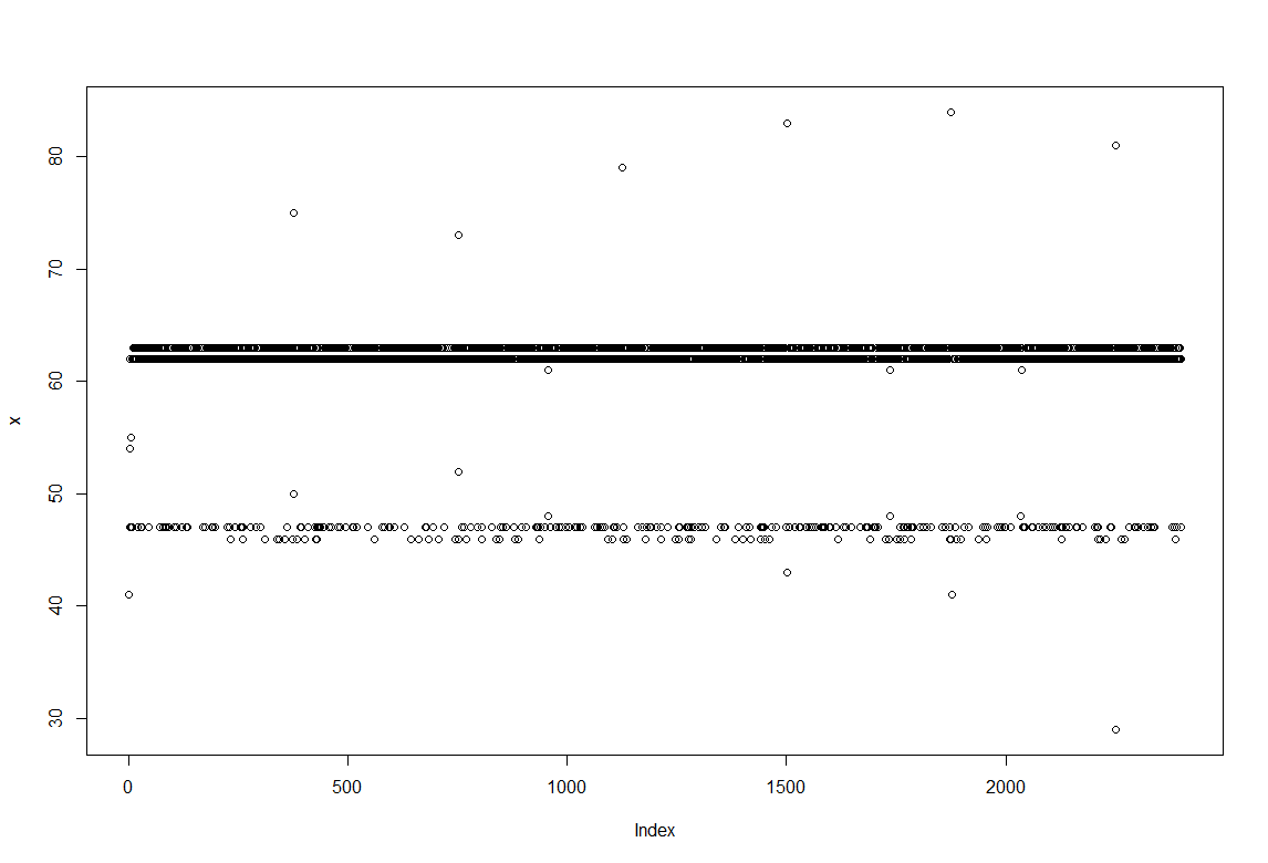
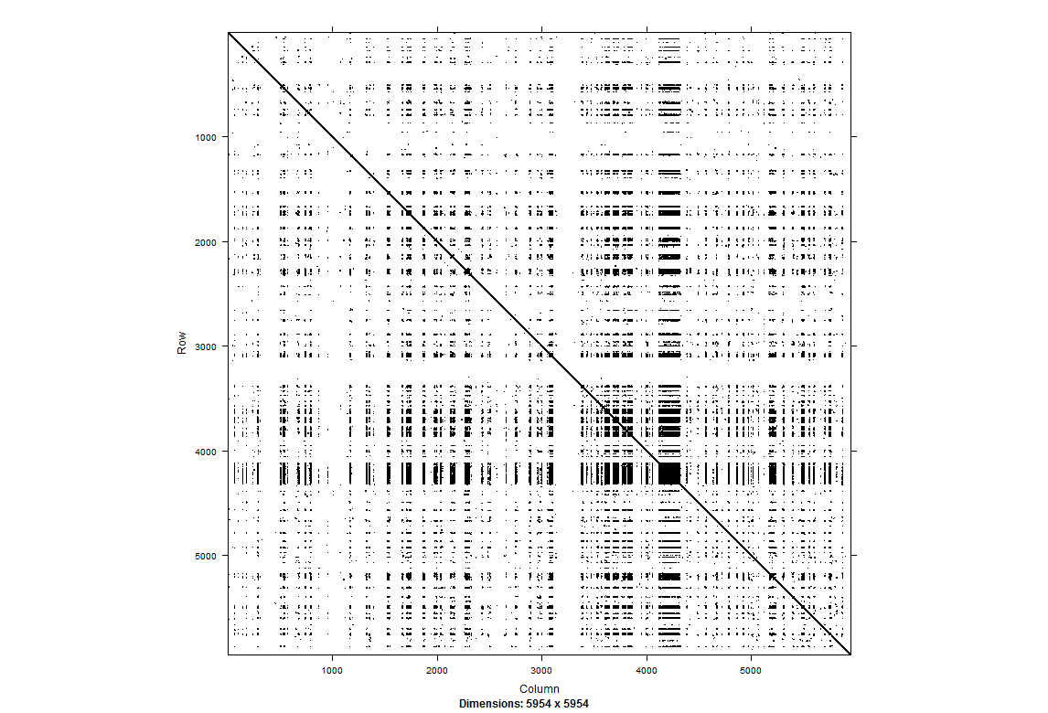 The sampling rate is not homogeneous and this affect a lot the processing of the data for non linearity. What can be done? On the right we see a recurrent plot of one single fly in darkness for 5 min. It seems to be to some extent periodic, not much chaotic (but I need more experience to really guess that) For more information https://www.recurrence-plot.tk/rqa.php.
In the table below we see a low recurrence but high determinism among many other parameters.
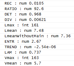
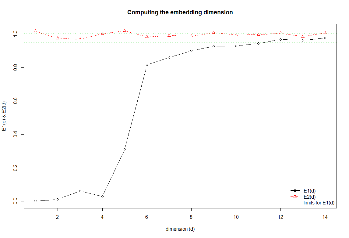
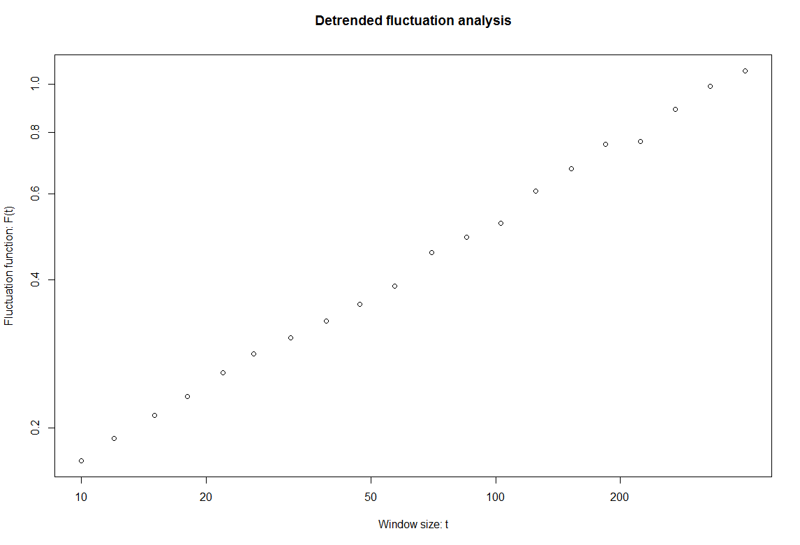 The E2 line shows values around 1 the whole time when the sample is random. This is contradicting the above. The detrended fluctuation analysis show a value around 0.5, which means that if these data was modelled as random it would look like white noise.
Category: R code, Spontaneous Behavior | No Comments
automatic uplaod of data. step2
on Sunday, December 2nd, 2012 3:41 | by Julien Colomb
Figure of result, data, raw data and code uploaded automatically. Still need to get a way to get the statistical analysis published along with it.
I will try to make a video to highlight how fast and easy it is once the code is written.
Bjoern, when do you want to present this? Do I have time or should I do it tomorrow night ? :-)
the R code was made public: everyone can access it without login
Category: open science, R code | 3 Comments
Automatic upload of data on figshare: step1
on Wednesday, November 21st, 2012 7:38 | by Julien Colomb
https://figshare.com/articles/PKC53e_putative_mutant_in_self_learning/97792
This was 100% uploaded directly from R.
First step toward automatic upload of data accomplished!
more permanent link, I think: https://dx.doi.org/10.6084/m9.figshare.97792
Category: open science, R code | No Comments